

The samples below represent only a small fraction of the projects—and types of projects—I have designed or finished over the years.
E-mail: dave@catspawdtp.com
catspawdtp@icloud.com
Office hours: weekdays 9 AM to 5 PM Pacific time
My career in graphic design and layout began in 1987, when I hired on at a small publisher of monthly technology magazines. Since then I’ve handled a wide variety of print publications—books and booklets, magazines and newsletters, brochures and datasheets, packaging and inserts, posters and postcards. If it’s printed, I probably have worked on it or something like it.
Today I use Adobe Creative Cloud and the Internet to serve clients across the United States and beyond. I use clean, accessible design and lay-out to convey the client’s message clearly and precisely to readers. Exacting attention to detail and an excellent command of printed and spoken English—grammar, punctuation, spelling, and typography—help ensure vivid, unambiguous communication of that message, whatever it may be.
By far the largest and most ambitious project of recent years, ROAN is a role-playing game rulebook for a “dieselpunk” world of sapient equines, gryphons, anthropomorphic canines, and many others. Role-playing games tend to be heavily illustrated and to contain many charts and tables; in recent years background textures have come into vogue. Collaboration with the cover artist, Baron Engel, ensured there would be plenty of space for a title logo and ancillary text on the wraparound cover.
Gathering Storms is the first novel of a series, aimed at teens and young adults, published by Thurston Howl Publications. Cover art and type choices were provided by the publisher; they were integrated into a new design that incorporated matching backgrounds and additional imagery. The interior was designed to be simple and readable, with title type suggesting digital displays—calling back to the sophisticated genetic engineering technology behind the story’s premise.
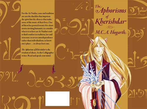
The Aphorisms of Kherishdar and The Admonishments of Kherishdar are a matched pair of story collections written and illustrated by MCA Hogarth exploring the very alien empire of Kherishdar. The former is written from the viewpoint of a professional calligrapher; the latter from the viewpoint of one who administers judgments and punishments under the aegis of imperial cultural and legal norms.
The Laundry Dragons is a whimsical children’s book by M.C.A. Hogarth, who wrote, illustrated, and published it. As is often the case for children’s books, design of the interior required a genuine collaboration for best presentation of the artwork and text.
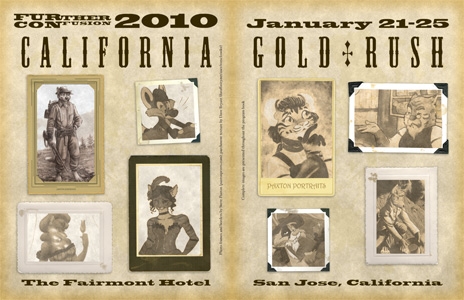
For several years I served on the committee of an annual fan convention, designing and laying out the souvenir program books. Each year a different theme would be selected, around which publications and décor would be designed.
A Rose Point Holiday is the fourth novel of the Her Instruments science-fiction series by M.C.A. Hogarth. Ms. Hogarth usually creates her own covers, but prefers to collaborate for the interiors—generally choosing the title typeface and requesting large body type for readability.
Even the Wingless is the first novel of the Princes’ Game series by M.C.A. Hogarth. Ms. Hogarth usually creates her own covers, but prefers to collaborate for the interiors—generally choosing the title typeface and requesting loose leading for a luxurious feel.
Vick’s Vultures is the first novel in a new science-fiction series from Parvus Press, who requested a simple, basic design for the interior, with large readable body text and a specific type family for title type, running heads, and drop caps.
Gettysburg and Lee’s Escape From Virginia is part of a series by Donald S. Lowry examining the U.S. Civil War, or War Between the States, as a chronological narrative over time. Though scholarly in approach, it also seeks to be accessible to the interested layman, demanding a formal yet readable design for the interior, with a generous gutter to account for a large page count.
Designed from scratch, with moderate direction from the client, this newsletter for a professional organization used existing choices of type in new ways and with new art.
Sent out every year to the members of a professional organization, this four-page brochure catalogs the training classes and other functions available during the titular event, and provides a registration form. The design called for a familiar look and feel while being sufficiently different to distinguish it from previous years’ brochures.
This modest catalog of memory products started from an existing design, but was rebuilt in Adobe InDesign and modified extensively.